Review: Atelier E. B.: Passer-By
Lafayette Anticipations (Paris), February 21 – April 28, 2019
Passer-By, an exhibition curated by Altelier E. B. that was on display at Lafayette Anticipations until April 28 2019, tackled an issue with which consumers come into contact every day: the multitude of ways that clothing can be displayed through artistic, kitschy, and historical contexts, and how this changes the way the clothing is interpreted. Beca Lipscombe and Lucy McKenzie, the designers behind Atelier E. B., claim that the concept of this exhibition was born out of the realization that their own designs did not transfer well to being worn on models’ bodies, leading them to reconsider the importance of the way garments are displayed. Because the curators’ research question concerns the common practice of displaying clothing through multiple lenses, the exhibition first opened to its visitors in an extremely inviting and familiar way.
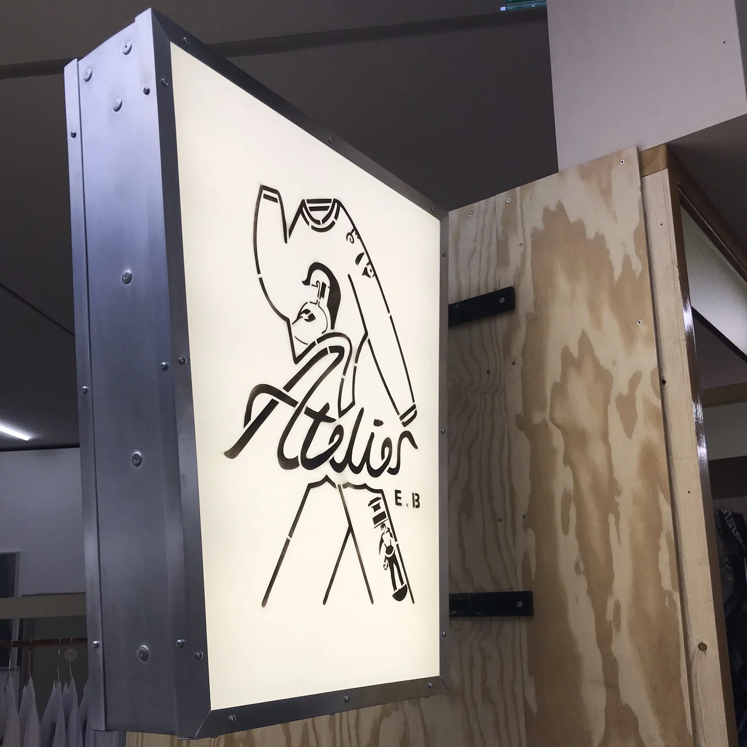
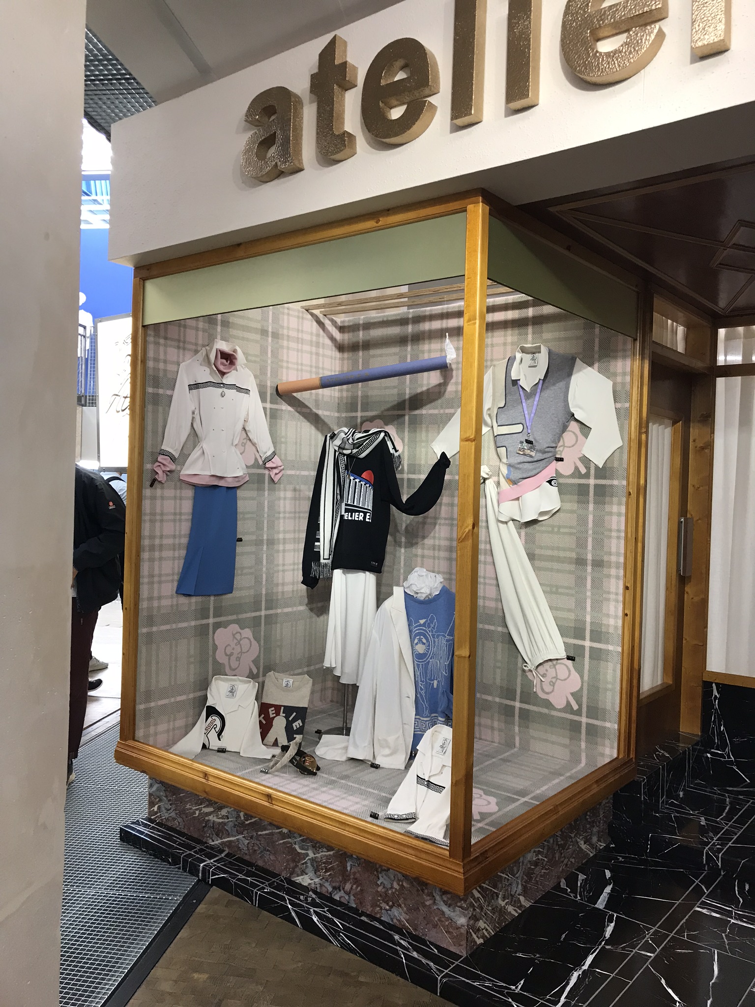
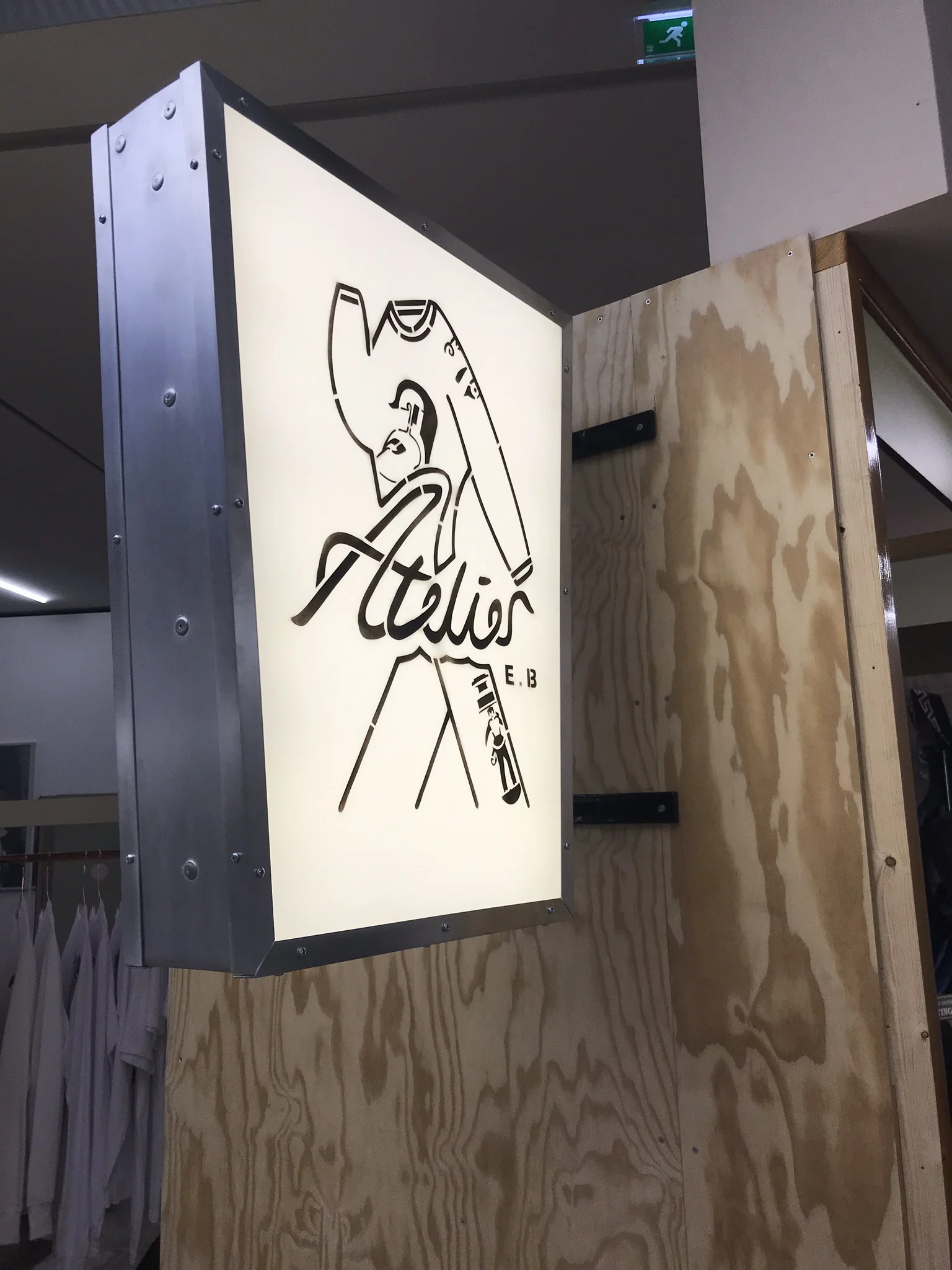
Lipscombe and McKenzie constructed a faux-storefront to greet their visitors at the entrance of the gallery, referring to the kitsch of provincial clothing shops throughout Europe and even North America, reminding visitors of their early interactions with fashion in the hometowns of their youth. The shop window featured a particular style of window dressing that was prominent up until the 1980s but is deeply cemented in that era, considered to be extremely tacky and in poor taste today. Garments were strung up by clear wires from the walls and ceilings and pinned to the interior of the window in active shapes that mimic human movement. Accessories were displayed on boxes on the floor of the window with props such as magazines and photographs of the garments, and each piece was paired with a small sign featuring the listed price in stamped black plastic. The detail of the window dressing was complemented by the distinctly 80’s mint-colored plaid carpeting in the window printed with a light pink E. B. logo framed in wood and built on top of faux-painted marble leading into the entrance of the store mock-up.
The heavy detail in the opening section of the exhibition was essential to drawing in the audience and imploring them to consider the way they have experienced displayed garments throughout their lives, and how the display of garment impacts the way the garment is received, much as Lipscombe and McKenzie had in their own experience with fashion design. This portion of the exhibition was eye-catching due to its references to popular culture, and accessible to audiences not necessarily knowledgeable about fashion. Their method strengthens a visitor’s engagement with the exhibition just as Marie Riegels Melchior asserts in her text “Introduction: Understanding Fashion and Dress Museology”: museum visitors experience fashion as a part of their everyday and respond well to fashion being exhibited in a recognizable and common way [1].
The designers’ effort to draw visitors into a three-dimensional, life-sized space continues into the next section of the exhibition, where Lispcombe and McKenzie constructed a showroom for their brand as well. Around the corner from the faux-storefront, a dressing area was constructed with curtains and mirrors expressing realism and familiarity for anyone who has participated in purchasing fashion, which is likely every visitor to the exhibition. Decorative racks in the brand’s aesthetic were built to display the garments in a very different way than the recognizable window design featured in the storefront, and the fake showroom also featured art and information referencing the clothing and branding of Atelier E. B. To answer the question asked by Alexandra Palmer regarding the effectiveness of the placement of an exhibition display in her article “Reviewing Fashion Exhibition,” [2] this opening was very effective on the part of the curators, as it immerses the audience in the exhibition in a tactile way, and allows visitors to relate to their thesis, regardless of any given visitor’s background in fashion studies.
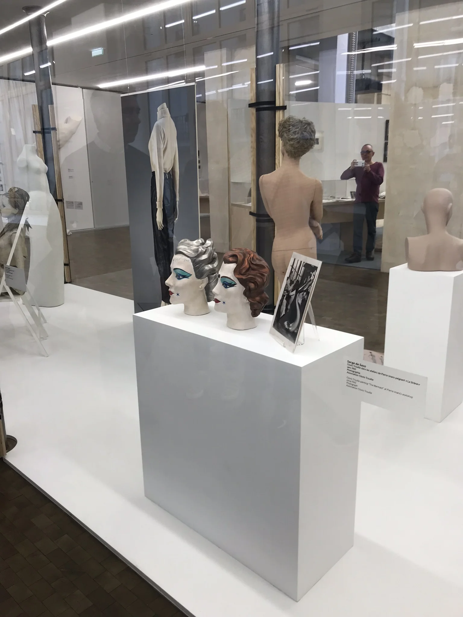
The immersivity of Atelier E. B. ends here, however, taking on a more traditional exhibition approach with glass boxes, plaques and video, as well as artistic display methods. After having entered the full first floor of the exhibition space, visitors were confronted by a large glass box displaying a variety of mannequins from varying decades of the twentieth-century, which address the historical context of the display of clothing. These mannequins featured many different notable appearances, including futurist sculptural styles, avant-garde face paint, and moveable joints through the use of netting, which all highlighted the impact of the artistic styles of a given time period on the display of clothing. These mannequins are not displaying any clothing and are featured bare in order for visitors to get a full view of their unique features, and this choice allows display practices to be considered without being overshadowed by the garments that dress the mannequins. In a traditional fashion exhibition setting, visitors are not typically meant to notice mannequins, as Clark and de la Haye highlight in their article, when describing museums’ lenience towards headless and faceless dummies [3], and if they do, the noticeable attributes of these mannequins are intended to highlight the garments themselves, so it was extremely important for the curators not to dress the mannequins on display -- to truly highlight the unique ways these objects impact the clothing they wear.
As the visitor moved throughout the remainder of the bottom floor of Lafayette Anticipations, they reached several examples of costume and clothing display that are far less obvious than a shop window. Along the far wall of the first floor stood a very traditional glass case featuring a British fashion doll and documentation about the doll allowing the visitor to consider more everyday examples of encounters with fashion. While this is an interesting take on exploring how fashion can be reinterpreted and interacted with in different settings -- as a children’s doll is an object of the home -- the case was placed in a corner and deeply overshadowed by the large case of mannequins and wall sculpture next to it. Ultimately, this portion of the exhibit was easily passable and ineffective in capturing a visitor’s consideration, especially compared to the opening storefront. Dolls are often used in the display of costume, as in other recent exhibitions such as the Dior retrospective, due to his creation of doll-sized garments. This proves that this is a strong strategy for exploring the relationship between clothing and the objects and bodies on which they are displayed; however, the plain glass case which featured books and papers more prominently than the doll itself did not provide the visitor with the same interactivity or chance to reflect on the display of fashion as the storefront and showroom.
Additional features of the exhibition which allow for reflection upon the display of clothing in everyday life included the projected videos of Disneyland’s “It’s a Small World” ride which presents countless dolls in inaccurate costumes, and a film concerning the window dressing and “mannequinage” of New York store windows. This attribute of the exhibition was evidently engaging and provided an alternative view on different worlds of “mannequinage,” utilizing an aspect of entertainment and education, which Valerie Steele asserts is important to a fashion exhibition in her work “Museum Quality: The Rise of the Fashion Exhibition.” [4] While it is clearly important to fully display actual clothing and mannequins in exploring the thesis of this exhibition, this material provides visitors a window onto the multiplicity of ways “mannequinage” appears in reality, and the multiple ways we interact with and receive clothing through mannequins.
Halfway up the central staircase, bordered by a bannister that partially features the original beaux-arts bannister of Galeries Lafayette, was an eye-catching sculptural installation of ancient Greek-look faux-marble sculptures wearing the actual Atelier E. B. garments displayed in the storefront and showroom near the entryway. This installation was intended to draw comparisons between the Grecian inspiration of Atelier E. B.’s aesthetic, as well as the way clothing is sculpted on statues, with the way clothing is dressed on mannequins. While this is an interesting concept, it seems somewhat promotional of the clothing brand’s own aesthetic, compared to the more research-driven content installed on the first floor. This can be compared to the phenomenon of fashion retrospectives of living designers which have been heavily critiqued as tools of promotion over education, as is explained by N. J. Stevenson in her work “The Fashion Retrospective.” Stevenson discusses the way Diana Vreeland’s Yves Saint Laurent retrospective at the Metropolitan Museum of Art in 1983 was criticized for praising the designer in an opulent way to make sales and promote the designer’s brand [5], and while this exhibition is not solely dedicated to Atelier E. B. and was curated by the designers themselves, there is a note of self-promotion detectable. However, Stevenson recalls in her article that promotional exhibitions are not exclusively received as negative and can still present important discourse to fashion academia [6], just as Passer-By does formulate an in-depth consideration of the impact of clothing display. This second-story installation does lose touch with the concept of connecting clothing display to the everyday life of the visitor that was prevalent on the first floor, but perhaps this installation was intended to transition between concepts.
The remainder of the exhibition on the second-floor featured art installations displaying fashion objects from Atelier E. B. in creative ways, proving to its audience that garment display is comparable to art and sculpture and that the line can be blurred. This presents a contrast to the curators’ research of the methods of garments display in the first half of the exhibition, and allows the visitor to experience both a historical approach to their thesis, as well as an abstract and artistic one. The mid-section of the second floor features a far more modern take on a shop window; however, this window did not attempt realism in the same way as that at the entrance, and therefore was not as immersive as the entry installation. Regardless, it offered a comparison between historical and contemporary approaches to window dressing, which could have been furthered had these two installations not been featured as distantly as possible within the exhibition layout. While this comparison may not have been intentional, it could have been another unique take on their thesis, allowing visitors to further explore their experiences with fashion display in a cultural context.
Ultimately, while the sculptural take on displaying garments was attractive from an artistic perspective and portrayed different relationships with clothing and the body -- which was part of the original drive behind the curators’ research -- it did seem disjointed in comparison to the first floor and much easier to pass by in comparison to the rest of the exhibit. The marriage of art and fashion is an extremely relevant discussion today and deserves a spotlight in an exhibition such as this, but somehow felt disconnected to Passer-By as a whole, and surprisingly forgettable. It is promising, however, that fashion and art can be intermixed in this way, and that the designers at Atelier E. B. found a method to display their own work with the work of noted artists of many mediums in their exhibition, while still exploring the thesis. This heightened the display of clothing to a new level beyond the traditional “mannequinage” which is described by Clark and de la Haye in their article [7], and has reigned over fashion exhibitions since the development of the fashion exhibition.
Lipscombe and McKenzie constructed an approachable exhibition that interpreted fashion in a unique and niche way. Their exploration of their thesis delves into educational, historical, as well as creative and immersive realms to draw in the audience and present their research at the same time, even if the presentation was at times disjointed. Their use of supplementary materials provided a multiplicity of relatable perspectives to their research question and ultimately it was a highly relevant exhibition for fashion academics as well as those who rarely think about fashion.
Notes
[1] Marie Riegels Melchior, “Introduction: Understanding Fashion and Dress Museology,” Fashion and Museum: Theory and Practice, (2014): 5.
[2] Alexandra Palmer, “Reviewing Fashion Exhibitions,” Fashion Theory 12, no. 1 (2008): 123.
[3] Judith Clark and Amy de la Haye, “Introduction,” Exhibiting Fashion Before and After 1971, (Durham: Yale University, 2014) 18.
[4] Valerie Steele, “Museum Quality: The Rise of Fashion Exhibition,” Fashion Theory 12, no. 1 (2008): 14.
[5] N. J. Stevenson, “The Fashion Retrospective,” Fashion Theory 12, no. 2 (2008): 223-224.
[6] N. J. Stevenson, “The Fashion Retrospective,” Fashion Theory 12, no. 2 (2008): 223-224.
[7] Judith Clark and Amy de la Haye, “Introduction,” Exhibiting Fashion Before and After 1971, (Durham: Yale University, 2014) 14, 18.


